It has been a while since I have written an actual article on the blog that isn’t QotW-related, and I am sorry to say that this one is also not going to be a scenario analysis. I have some other priorities right now, but I will continue with the NM Dream-chaser cycle once I have finished. As some of you may know, I am in the process of writing a new book for the blog. It will be a sort of follow-up on the Field Guide I wrote in 2022, but instead of being scenario-focused, I am writing more on the different traits and mechanics that you can include in your deck. An introduction to that book was published on the blog earlier this year, and I have spent some time working on the rest of the book.
I cannot spoil too much on the book’s contents for now, as that will deserve its own article. The basics of it will be a merger of all my Trait articles, updated for the completed card pool. This book will come in 4 sections, with individual chapters for each trait and mechanic that you can include in your deck. This ranges from the bigger archetypes like Gondor to the smaller ones like Pipes and Harad. The archetypes with only a handful of characters and no real synergy will be excluded from this book (sorry, Ghan-buri-Ghan).
The book will have separate sections for AleP as well, as those have the most fleshed-out addition to the card pool, and build a lot on already existing archetypes. As the team is currently in the midst of its second cycle, I won’t be able to write on the archetypes they are developing at the moment, but will include everything until the Shire’s Reckoning. These chapters will be separate and deal with the improvements that AleP made to existing traits or the new trait synergies they developed.
At the moment of writing this article, all the content has been written and reviewed. We now just need to have everything look nice before we put it in the book and publish it. This will take another month or two, so I hope to have it finished before Con of the Rings this year. Once the book is ready, I will publish both a hardcopy and paperback version (which will be a bit cheaper but not lay flat) on the website I use to also publish the other books I have written. For those without a budget for additional game items like this, a PDF version will also be made available in exchange for donations of any size to the blog. This strategy has worked very well for the Field Guide and has helped to fund this new book. More news on when the book releases and links to the store will be shared once I am ready for publication.
But that’s not all I wanted to share today. I have an update on one of the important things when making a book like this: the cover. It is the first thing you see, and what I need to be done right if the book is going to appeal to people. So it wasn’t something I could do myself, and I had to hire outside help for it. And who better to approach than the person who has done the cover art for the Field Guide as well: Emily (Rook) Dillhunt. I was pleased with the previous commission that has since been turned into playmats, posters, and card sleeves, and I wanted to keep the covers in the same style. So I reached out and we arranged to start the commission in November 2024. This gave me a few weeks to come up withsketches and ideas.
Initial Concepts
My initial concept for the thumbnail was to have an object related to every trait surrounding a Palantir in the middle. The stone would shed a light, creating stretching shadows out towards the edges of the book. You can see my draft here:

It wasn’t too hard to come up with items for the major traits, but traits like Noble, Outlands, and Harad were a bit more difficult. Sometimes you need to bounce ideas like this off someone else and come to a conclusion together. This is what the VOTP Discord has helped me with, along with some friends within the community. I presented this idea to the artist, though she did have some valuable feedback.
The piece would probably not come across that great if we put all of these items on just the front cover and have them only poorly lit. Instead, it would perhaps be better to do something in the style of a still-life painting. That would mean a table with all the items on it, hiding different easter eggs along the way. I was quite enthusiastic about this idea, in part because I am a big fan of the classical Dutch still-life painting movement from the 17th and 18th centuries. To recreate it, we would have to put all the items on or next to a table, zoomed in a lot more than I initially intended. But in return, we would have a nice piece that could stretch both covers and be used for things like posters or playmats later on. We would still keep a reference to every trait, but a little less obvious than in my initial concept.
Draft Thumbnails
With that, the first sketches could begin. It took a while and we moved through different layouts, such as a concept that only filled one page, leaving the back for something useful like I did with the last book. But I had to step away from that idea, also because of my realization that very few people would be bringing this book with them to their games. It’s a deckbuilding book, not one that you would actually need to prepare for a scenario like with the Field Guide, or to log in your game afterwards. So I eventually went for the full-bleed that extends to the back of the book as well. This would make the entire thing feel less cramped and give more space for some of the banners in the back as well.

I did like the other concepts as well, as I do have a soft spot for symmetry. This can be seen in the cover of the Field Guide, where I have several things mirrored across the artwork. Hence why it felt odd to me to skip out on the first concept shown in the picture above, but it would be the right call to make. I feel that the design would look better for sleeves than it would for the book. The second concept shows how cramped everything would have been if we went for a single-page cover art instead of a full bleed. So we continued with that and started to add some more items to it.

We added a bunch more items to the table and had to come up with smaller items for some traits. Dwarves could not really get a pickaxe on the table, so we instead went with some coins and gems, which also ties into the Noble trait. I will not be sharing the list of the items and their possible links to the traits; I will leave that up to you to think about.
As you can tell, the items weren’t distributed evenly across the front and back cover of the book, so we went ahead to fix that with the next concept. I also want to cover the lack of detail at the bottom of the back cover now. I intentionally left that empty, as the barcode for the book would go there. So it didn’t make sense to fill that up with a lot of detail, and any items or easter eggs there would have been completely covered.

The next concept already had more detail and even more items to link to the traits. We also brainstormed on some of the final traits that needed some sort of representation. Again, Harad was a difficult one, since you can’t just put an elephant in the middle of the room to represent them. You may notice that the top half of the book is still blank. This is where the banners would be going. I went with 4 banners to represent the four starter decks that were introduced in the revised content. One for the Elves, though I went for a Noldor design over a Silvan one. One for the Dwarves, and one for Gondor and Rohan each. While these traits did already have some items on the tables, the banners were a nice way to frame the table with some background while giving a nod to the starter decks.

While the initial concept had put the scene in some sort of dungeon or in the basement of a castle, this wouldn’t really fit the tone I was trying to go for. Palantiri are not stored in deep dungeons but in high towers! (and also the bottom of rivers and frozen oceans, but that is irrelevant). Putting open windows behind the banners would also give them a more dynamic feel to them, and we could do some things with the background outside as well.
Two ideas were pitched, one set during the day, allowing sunlight to illuminate the table, and one set during the night, when the moon is instead visible in the sky, casting a softer light inside. I went with the nighttime setting, as it made more sense to have a lit candle on the table, and I could do something with the stars and constellations for some extra hints to certain traits. So with the final draft sketch done, we went ahead to fully render this piece, add some lighting to the table, and color the entire thing.
Renders
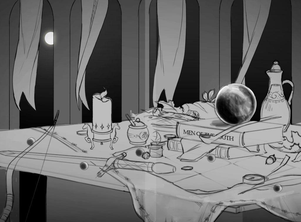
This part took a while, as the artist had several pieces to work on at the same time and the world was destabilizing a little more each day. But after a month since the final sketch, I finally got an update with some of the first renders in. This is also the first time that the piece had some colour. Some final details like the stars and the city in the background were now also added.

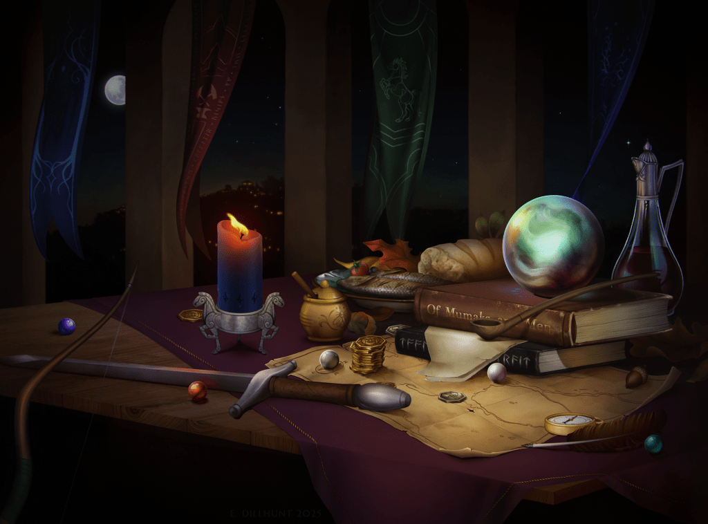
It’s funny to see some parts fully rendered and colored in already during this stage, while others are still in various shades of grey, as if it is a character roster you have yet to fully unlock. The star of the show for this piece was the pearlescent colors on the Palantir, making it stand out from stones in other depictions that usually show it much darker.
There was still work to be done though, especially for the banners which had yet to be filled in. I ended up changing the right-most banner to be purple instead of yellow, so that we have each sphere in the game represented. While this does force me to link the Rohan banner with the Lore sphere, which is the least used out of the four in that trait, it at least secured a nice reference to the major traits and those that have received Starter decks.
The next update came a month later, with all the pieces having been colored in, but some details were still missing. The draft for each banner looked really good. I was impressed with how distinct the banners looked without turning into flat planes in order to make out which faction it belonged to. I worked out a few more details and gave some pointers to the Dwarven runes on the banner, just so that it is an additional easter egg for those of you who can read those runes. Some final items, like the pillars, pipe, lower book, and the wine carafe, did need to be fully rendered, but I was happy with the progress that was made with this update.

Details and finishing touches
Finally, the piece was finished in mid-July, after the final pieces had been rendered and a few tweaks had been made. Major points of progress were the city in the background, the pipe, and the wine flask being fully rendered now. In all, the process took about 23.5 hours to fully complete. Along with the lower-res image below, I also received a higher resolution copy of the piece to be used for the finished product. This version is available to all Patreon subscribers who would like to make something of their own with this artwork. Think of playmats, posters, or desktop backgrounds. Check the link on the Patreon site to get access to the full version of the art.
Products
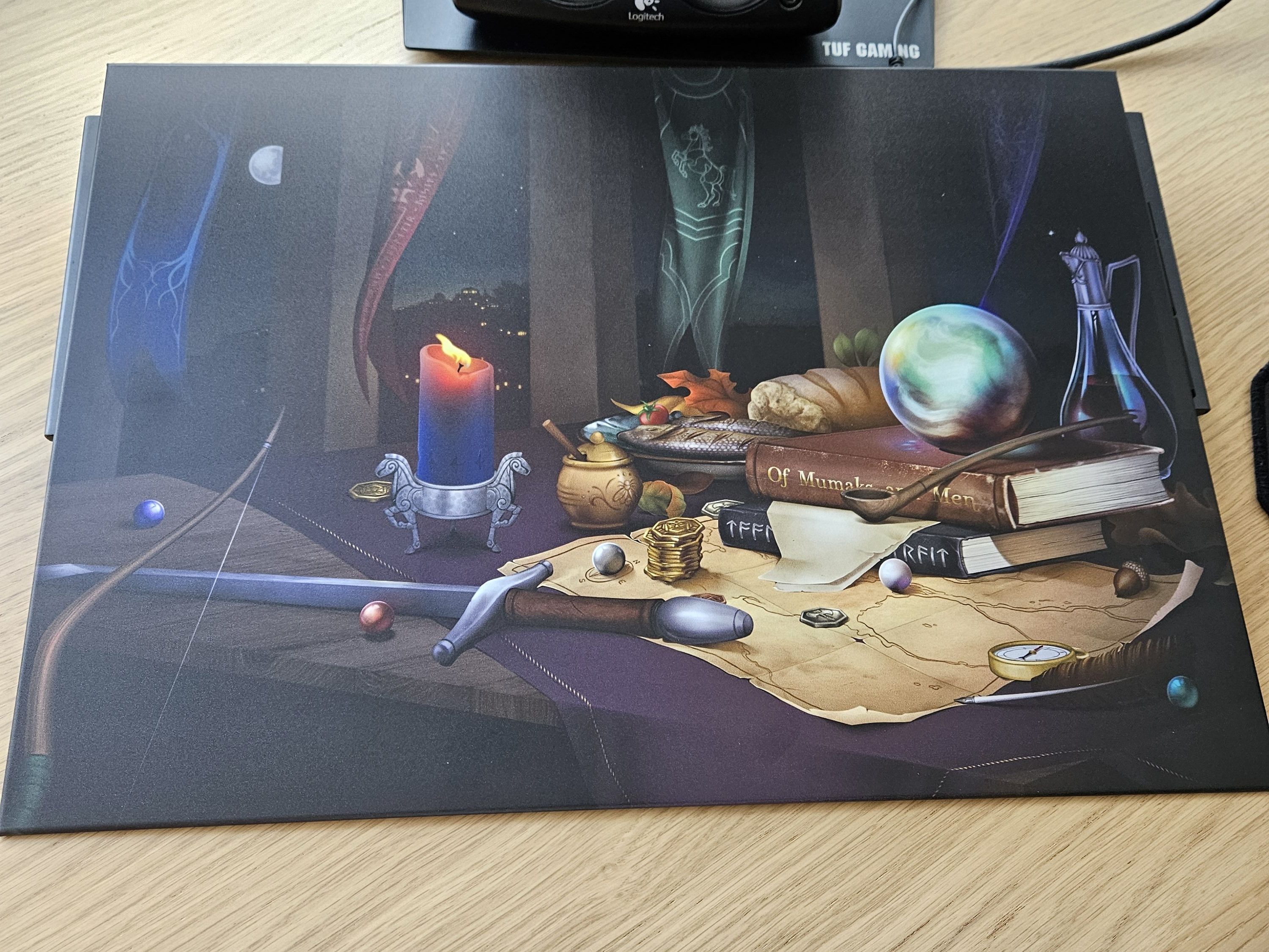
As mentioned, the idea is that this cover will be used for the upcoming book “Tools of the Trait.” But I want to make the most use out of this commission as I can! And while the cover of a book is nice, you don’t usually see it when it is put away in a bookshelf. The different aspect ratio also made the artwork less suited for card sleeves that I made last time, as half the artwork would then be cut off. So I did a few trials with turning this into a metal poster. No, this article is not sponsored by Displate, but I did have to use their service to get this design printed out on a pretty nice-looking poster. This design is not for sale in their shop, though Patreon supporters could download the higher resolution version to make their own. I also have one with the old Field Guide design, so that both can be hung on the wall of my gaming room.
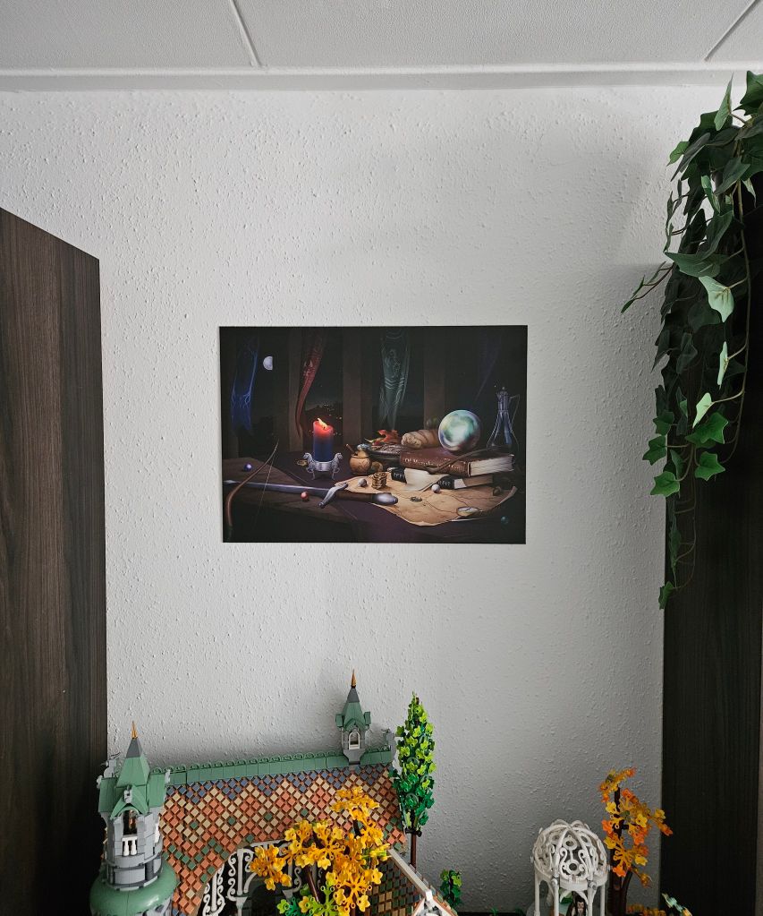

The artwork also makes for good postcards, so I might consider making those and handing them out to people I meet at conventions. This sort of mini-poster also makes for a nice display piece if you are gathering artworks from the game and its community.
I could have also gone with playmats again, like I did for the previous artwork, but decided against it. I already have more than enough playmats and don’t need another one. The design would work well for them, so I will have high-resolution images available to Patreon supporters if they want to make a mat with this.
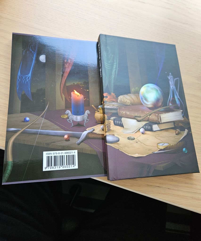
And of course, I had to make some trials with the artwork as an actual book cover. So I used an old version of my Field Guide and wrapped the artwork around that. The pictures below aren’t the actual completed book, as the content inside is just that of the Field Guide. It gives a good look at how the cover would look as both a matte hardcover and a glossy paperback. As the book will be available in both formats, it was important to me to ensure that the cover worked with both finishes.


That’s all I have to share for now. Patreon supporters can check out the link to the full resolution piece on Patreon itself. I will be keeping you all up to date on the progress of the actual book, but we are still a few months away from publication. The process to get the cover done lasted 9 months, but I am glad I didn’t rush into this or use something AI-generated. It is important to support artists with commissions like this, even if it does cost more. The donations to the blog and the ongoing support of the Patreon supporters made this piece come to life, and I’m so happy to share it with you all.

One thought on “Art-icle: Tools of the Trait”