With everything going on right now, I needed a distraction, and while I’m not feeling good enough to write a full scenario analysis, I did want to start putting out content on the blog again. So I’d like to take you all on a journey to explain how this year’s swag got its cover and why you might see this artwork appear a bit more often on the blog and associated channels. I have learned a lot during this process and would like to share some early drafts and walk you through it all to get to the final piece and what I did with it.
When brainstorming for the loot of 2022, I quickly decided on another book. It’s easy to ship, easy to carry with you to a convention, and last year’s playthrough notebook has been a huge success. So a book was the best option for me. While I won’t discuss the contents in this article, I will be doing another article on what motivated me to make it a Field Guide to LOTR LCG. But since the books aren’t completely finished yet, you’ll have to wait for that one. I did know ahead of time that the cover of such a book would be as important as the contents. In the past, I have used Beorn’s excellent scenario map of the game, but you can’t really use the same cover for the new book. While it would still be distinguishable by the fact that the new book is a hardcover, it isn’t a really original idea anymore.
So I weighed my options. I could leave the book blank, perhaps with some trackers on the back and a simple title on the front. While I liked its simplicity, it doesn’t really show the love for the game. I could also take some cover art from the internet, but there are some moral reasons that forced me to look at other options. I was then inspired a little by the FarCom project that is helping AleP to get commissioned artwork, and I looked at who would be a suitable artist to illustrate the cover. While this would obviously cost more money, the blog’s Patreon has been doing ok this year, especially with all the new players joining the game back in January. So there was a bit of money to use for this idea, though I knew I couldn’t afford a piece by John Howe with it (though that would have been epic!).
My thoughts went quickly to an artist you may have heard from before: Emily Dillhunt. She is responsible for the Red Book illustration on the COTR sleeves from 2021. What really sealed the deal for me is that she has done a number of card backs in the past for the digital translation of the game in the form of the ACG. These card backs should really have been made into sleeves by FFG when the two games were being sold in the Collector’s Edition, but sadly that never happened. I did also meet Emily during Con of the Rings 2018, where I bought several prints of the artwork, which are still in my room today. And since the book’s cover would be in the same orientation as the card backs and the sleeves, I decided to reach out.
While her commissions weren’t really open when I reached out in March, there was more than enough time left for me to wait until they were open again, so once June rolled around, we got into contact again. In the meantime, I worked on some ideas.
Initial sketches
I was inspired to have the artwork feature the Palantiri (shocker, I know), but when I read through the books, I came across a poem about them at the end of The Two Towers. I’ll share that poem here:
Tall ships and tall kings
Gandalf, The Two Towers
Three times three,
What brought they from the foundered land
Over the flowing sea?
Seven stars and seven stones
And one white tree.
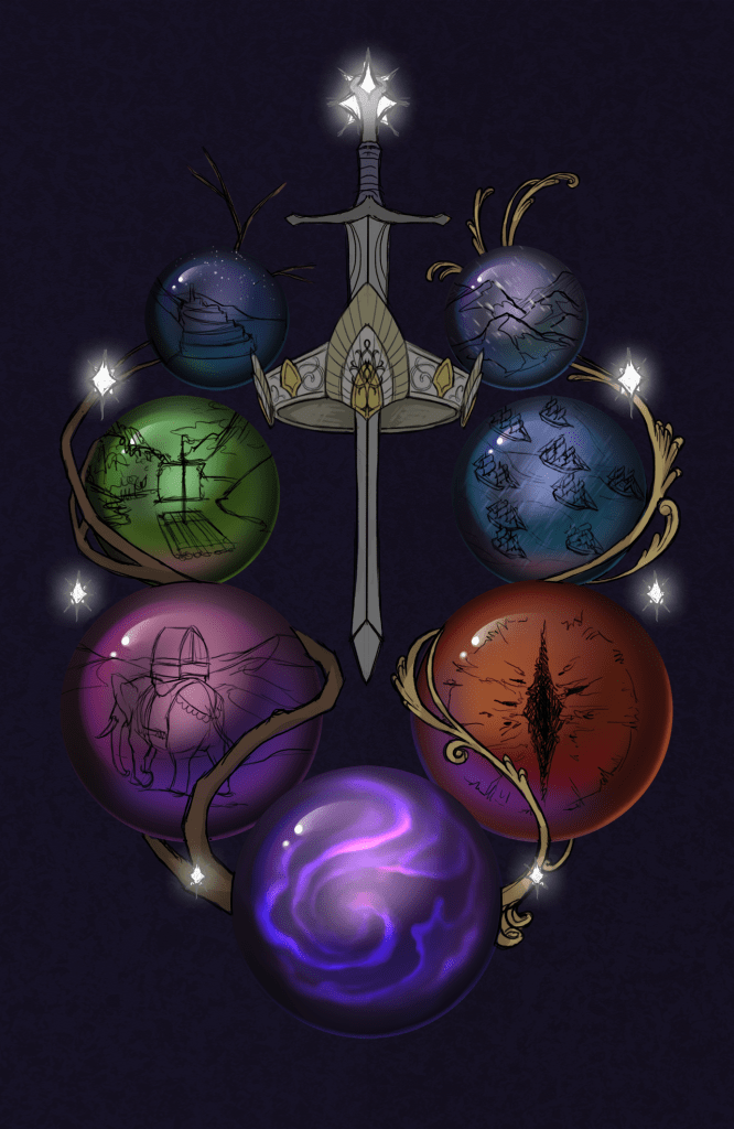
The poem describes the coming of the Palantiri to Middle Earth with Elendil after the downfall of Numenor. The poem also mentions some other iconic items of the realms of Gondor and Arnor, like the white tree of Gondor, and the Elendilmir, the stars of the Dunedain. I wanted to capture this poem on the cover as a base and maybe expand from there. The first draft that I did had the seven stones arranged in a sort of semi-circle, with the seven stars between them. To connect the stones a little more, I had one side encased in the branches of the white tree, flowering with white petals to signify the kings. The other side would be encased with Narsil, wrapping around the stones to signify the military power of the Numenoreans at that time. I wasn’t completely sold on the idea of a flexible sword, but as an idea, it was a good place to start from.

Since the stones themselves would be empty in the initial sketch, I wanted to do something with them. To link the game with the art piece, I decided to depict several scenes from both the lore and the game itself. The center Palantir would be empty since I imagined that is where the wrapping tree and sword would go. It would be too crowded for something inside the stone. But the other six could be used for this idea. I came up with the following scenes.

- To continue with the poem’s idea, I wanted to depict the nine ships of Elendil fleeing to Middle Earth during a storm. Not only would this work with the poem, but it would also symbolize the Dream-chaser cycle and other times that the game has featured ships (like the final expansion, the Hunt for the Dreadnaught).
- I also wanted to show off the architecture of the Numenoreans since they did build a lot of cool structures quite soon after they landed. I went for Minas Anor/Tirith since it’s probably the most iconic city. I went for a night scene with this one, as if someone is standing on the Pelennor at the same time that players are uncovering the plots inside the city during The Steward’s Fear, one of the community’s favorite quests.
- You gotta have one Palantir with the eye of Sauron in it. It’s also a nod to Necromancer’s Reach, the iconic Core Set treachery. This was a very simple stone to come up with.
- Race Across Harad might not be the best quest ever made, but getting to ride a Mumak across the deserts of Harad is something you can use to really hook in some new players. I went for this scene to give the piece a bit of calmness and to show that the stones could look pretty far when used.
- Three mountains in a snowstorm were used to represent the Dwarrowdelf cycle and the Ered Mithrin cycle. There are a lot of Mountain locations and weather treacheries in both, and while quests like Withered Heath and Redhorn Gate are not as iconic as other quests, I feel they struck a good balance with the other stones.
- Speaking of iconic quests, I had no choice but to include a nod to Journey along the Anduin on here. It’s probably the quest played most by players. It’s a great introduction to the game and its difficulty, worthy of a spot on the art piece.
With these ideas sketched out, I presented my plans to Emily to have them done professionally. As you can tell from these sketches, it’s a good thing I didn’t decide to save money and do it myself 🙂
Concept art
In a long email chain, Emily and I worked out the ideas and discussed various things that would or would not work from my initial sketches. One thing that got axed pretty early on was the wrapped sword around the stones. I was not really looking for a flexible, warped version of Narsil, as it did look a little weird. Instead, the sword got added as a centerpiece between the stones and stars. In its place, a metal filament was used around the stones. It’s not quite the show of military power that I would have liked, but there wasn’t really a good way to show this. The metal did contrast nicely with the wooden wrapping of the tree on the other side. The wrapping was also removed from the center stone, which would allow for an extra scene inside. But I had set my mind to an empty stone, perhaps with some of the swirls that you see in the movie’s depiction of them.

To even better signal the tall kings from the poem, I went a little beyond my initial plans and wanted to include a crown in the piece. I thought that it would work nicely with the artwork and somewhat represent the crowning of Aragorn in the books. We decided that the crown would fit well in the middle of the piece surrounding the sword, filling up some empty space there. With that added, Emily took some more time to flesh out the scenes in each stone and started to consider colors for the piece.
Colors
I had already decided I wanted a dark blueish/purple background for the piece. Not only because it is my favorite color but also because I thought it would look royal enough and contrast nicely with the rest of the piece. The stones themselves would each be given a distinct color as well, allowing them to really pop against the background. The scenes inside would just be shaded, not colored in completely. That would have cost more time and effort, and I think it would have made the piece too chaotic. So each stone would just get a primary color and a bit of a gradient to help sell the fact that the stones are round. The surrounding stars would be a pale white, radiating some light to the rest of the piece. I went with a large star up top and then reduced the size of the stars as they moved further down. I had wanted to do the same with the stones at some point, but that would have made it more difficult to show what each scene was. It’s still reduced a little bit in the final piece, adding some depth to it.
With the colors decided on and some sketch work for the scenes done as well, it was time for another WIP update. You can already tell that a lot of progress has been made here, though some shading and detailing are still required for the scenes and the sword+crown in the middle. The flowers of the white tree were also still missing at this point, but the idea of this update was to show how far we’ve gotten from the initial outline sketch. I was also really happy with the use of color here, as well as the lighting of the stars. The background was a little too dark, though, but that got changed in a later update. We also decided to swap some of the stones around since some required more detail, and it would be easier if the stones were a little larger.

The next update fixes a lot of this. You can really see what difference the slightly brighter background makes. In the initial attempt, the stone’s darker edges blended more with the background, making it difficult to see where each stone ended, thus making it feel like they weren’t exactly round. But now it was fixed somewhat. We also pointed the Mumak the other way and already added some detailing on its behind (priorities!). The blue of the Ship-Palantir was also changed to a different hue since it otherwise looked a lot like the Minas Tirith one. There were a lot of blue spheres in the previous one, so it was nice to be able to give them a slightly different shade of blue to make them more unique.
Detailing and finishing touches
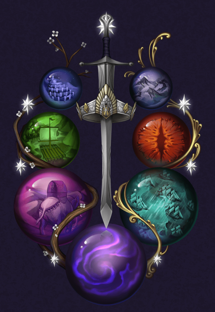
With the layout finished and colors figured out as well, the final detailing of each scene had to be done. The crown and sword also required some shading, as they looked great but were a little flat against the background. The stars, at this point, had also not been touched for a while. Though their light masked the draft state they were in, it could still do with a bit of polish. So the next update handled all of that. It was also the last time we touched the front cover, being satisfied with the results.
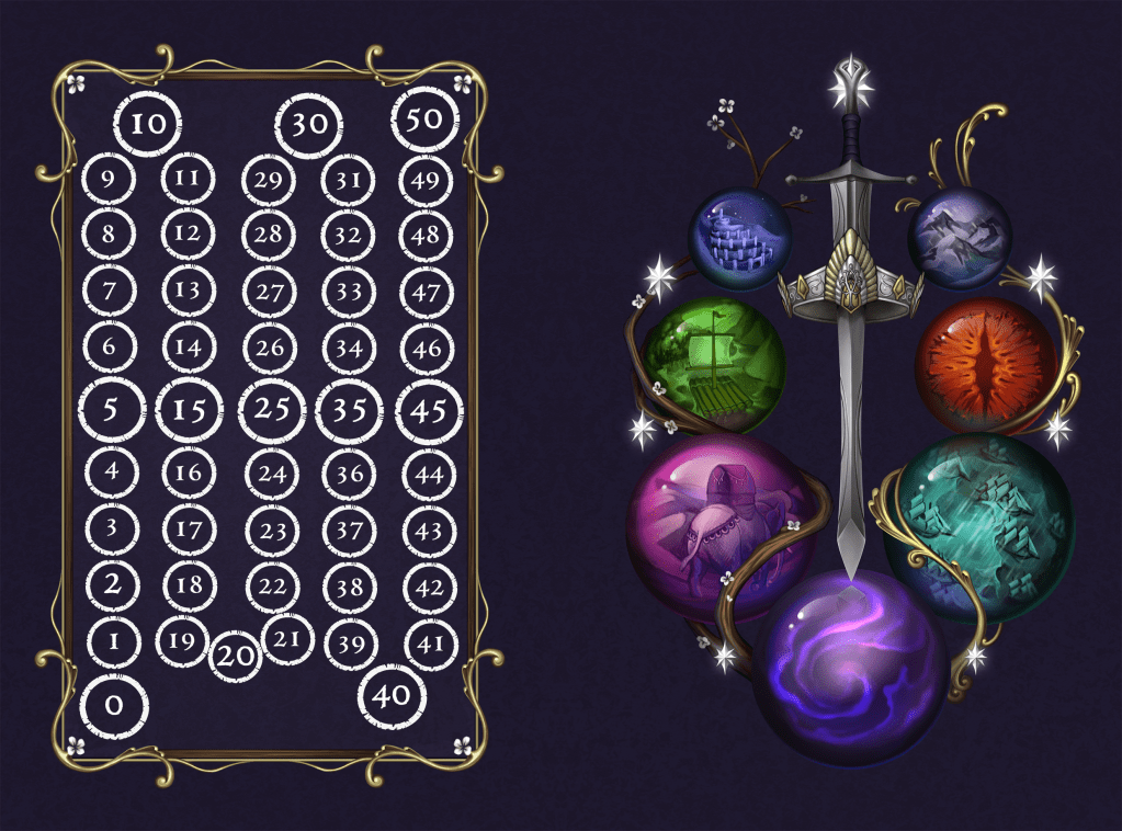
Our minds now turned to the back of the book. I had long ago decided to make it into a scoring track for people to note their willpower, threat, archery total, etc. But to just have that on a blank background didn’t feel right. So I asked Emily if it was possible to make a border for the background using the two wrapping materials used on the front of the book and make a nice border with those. We did not want to use the same border on the front of the book since that would mean we’d have to reduce the size of the main piece, and it would be a bit too busy for the front cover. With the border finished, I added the scoring track on the back cover myself. I do have some skills in Photoshop and thought that this would be a good test for them. The only issue I came across was that the barcode of the book would be in the way of the middle of the scoring track, so I had to make some adjustments there. I also went with a white font for this to contrast with the darker background. This resulted in the final piece for the notebook, shown below.
Products
Now that the artwork was finished, it was up to me to decide what to do with it. While the goal had always been to use the artwork for a notebook, I also wanted to try some other things. The higher-tier Patreon supporters of the blog usually get something extra from me as well, so I had to think about what to give them. I came up with two ideas that passed the prototype stage: A playmat with the artwork and sleeves with just the front cover.
Sleeves
I have made custom sleeves in the past with the DragonShield sleeve crafter and have had great results with them. But they are quite expensive, and since COTR had done sleeves last year (400+ per supporter, crazy), I didn’t want to just hand these out to everyone. Those that did select this option got 110 great quality sleeves with the artwork displayed on the back. This is a bit smaller than the intended size of the artwork, but most of the detail is still visible in the finished product. And I finally got what I asked for many years ago: An art piece by Emily Dillhunt on the back of the sleeves! Suck it FFG!
Playmat
Another common thing that players ask for are playmats. These are quite rare for the game, especially for newer players. But with InkedGaming allowing you to make mats with your own artwork on them, it made for an easy product to offer to supporters. At least, so I thought. The problem with playmats is that they are landscape orientated, and the artwork is portrait orientated. I could have rotated the entire piece, but I really felt that it would be a weird-looking playmat if I did that. Instead, I maximized the image on the playmat and used the border of the backside to fill in much of the empty space surrounding it. This helped the mat a lot, though there are still some empty areas. I don’t mind those, to be honest. I also had the option to add the scoring track to the playmat, but I thought that it would be too much, especially if you are playing your deck on the mat and still have to leave space to move a token on the mat as well. Plus, whoever gets a mat also gets the book, so they can track on there.

Book
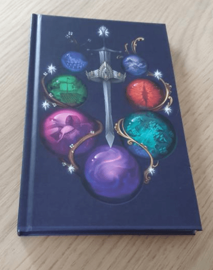
While at the moment of writing this article, I do not have the book’s contents finished, I did want to do a trial with it to see how the cover holds up. So I ordered one and was delighted to see that the artwork fits nicely on both the front and back. This is where I noticed that the bar code would interfere with the scoring track on the back, so I had to make some adjustments. I left the spine blank for now but might put the title there for the real print run, in the same white as the scoring track. The color of the background is a little lighter than for the sleeves and playmat, but that’s ok. I’m really looking forward to everyone receiving this.

.
.
.
.
.
.
.
.
.
I hope this project overview has shown you all what goes on behind the scenes. There is a lot involved with loot creation like this, and I haven’t even talked about the work that has gone into the book’s contents. I hope to finish everything soon and be able to ship the book to all supporters before the end of the year. Thanks for reading this far, and I’ll be happy to answer any questions in the comments.

That’s simply fantastic Daan.
You do such a great job with promoting the game – you do so much hard work.
All best wishes
LikeLike
Amazing work. Lots of thoughts had went into it.
I totally enjoy the read about your journey to create this stuff.
I like most is the threat count
Looking forward.
LikeLike
Super interesting hearing about the process and the many changes you go through to arrive at your end product. The results are stunning. Thank you so much for everything you do for the community. Keep forging ahead Daan, you are almost at the top of this mountain!
LikeLike
How do you feel mate?
LikeLike
All the chemo is now in, so I should start feeling better from here on out. The past week has been rough, but I’m doing better every day. Will have 6 weeks to recover a bit before my next appointment with the doctor, but that’s just to review whether or not the tumor has vanished. So the worst is definitely behind me, though I will need some time to get back to normal.
LikeLiked by 1 person